Gallery of Design and Advertising concepts and layout.
Tri-fold brochure used in fundraising for JCAT.
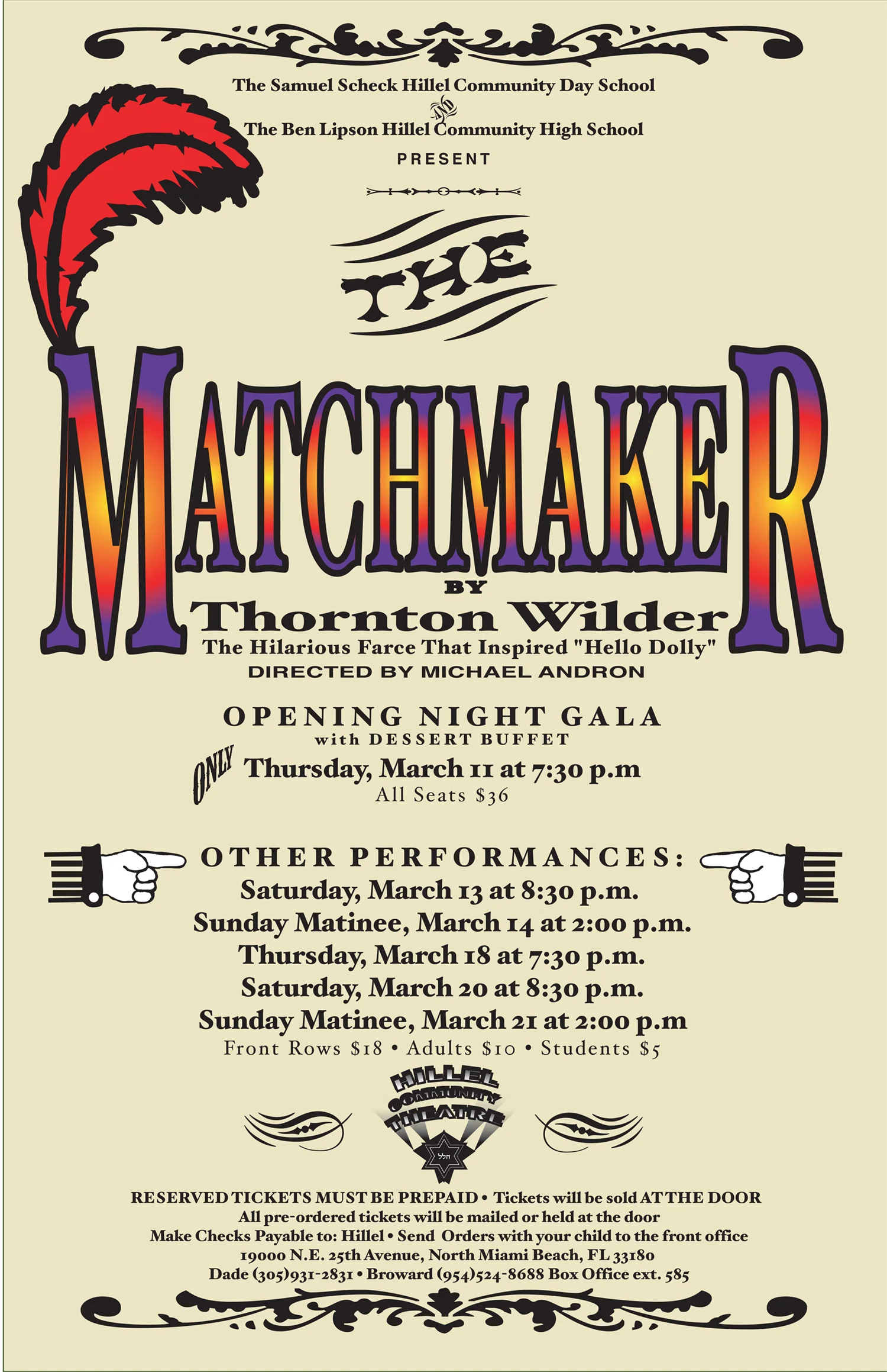
Playbills produced 4-7 times per year. Ranging from 20-100 pages, depending upon the size of the cast and the number of ads sold.
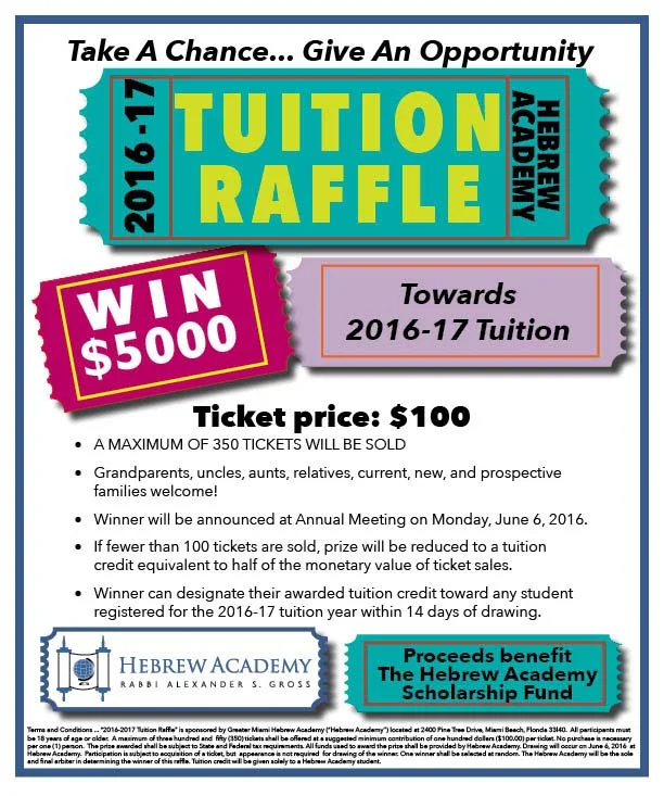
Promotional flyer for an annual raffle,
Flyer and promotional graphics for an Annual event at the greater Miami Hebrew Academy. See the press release under writing samples.
One of several direct mail pieces created in a variety of shapes and formats for the successful campaign to elect Catherine Vogel as State Attorney of Monroe County.
This poster was a particular design challenge, since the play is about an incident in a Catholic school and the central conflict involves a priest and nuns. Most posters, both for the play and the movie, feature Catholic imagery.
Since this was a production of The J's Cultural Arts Theatre and the banner would be displayed prominently at the parent organization (a Jewish Community Center), not necessarily seen by just theatergoers, this type of imagery was not appropriate. We choose to focus on the people themselves (not their position in the church) and the emotional feeling of doubt and uncertainty.
This poster is the winner of an American Graphic Design Award and an Addy. Photography by the designer.
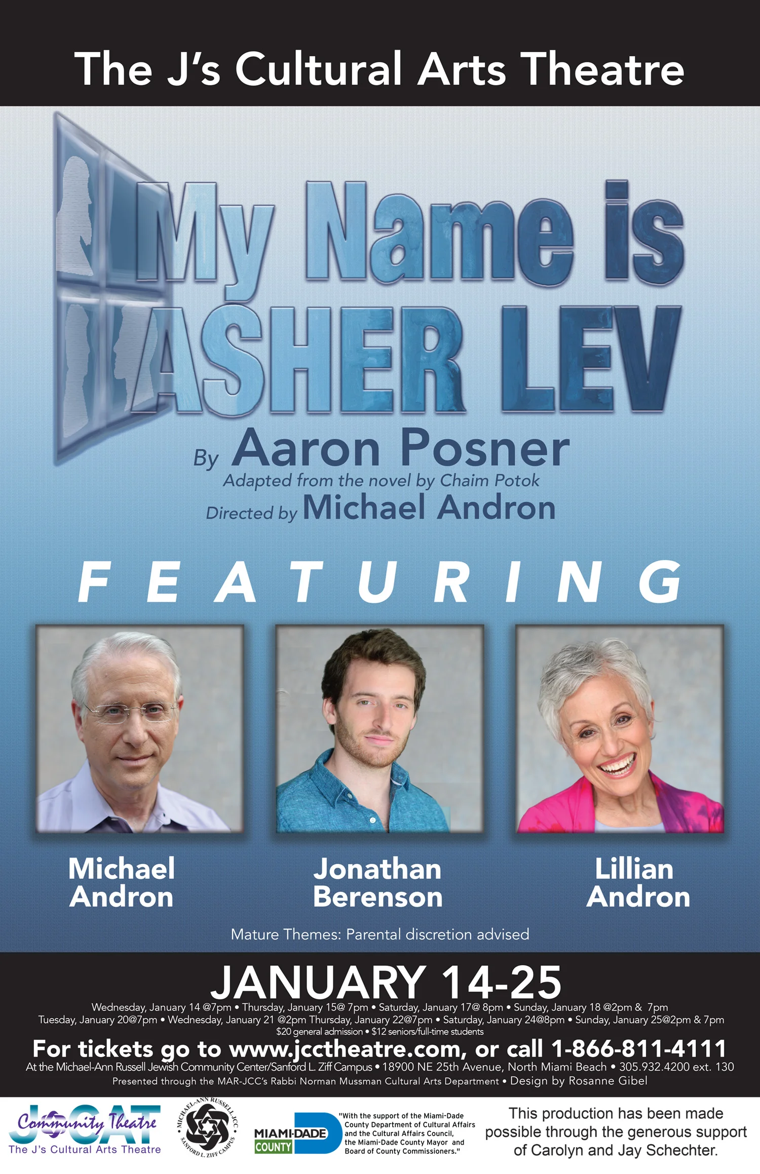
Poster for the play My Name Is Asher Lev. In an unusual move for this theatre company, the poster featured the three actors. They are well known in the community and it was a major draw.
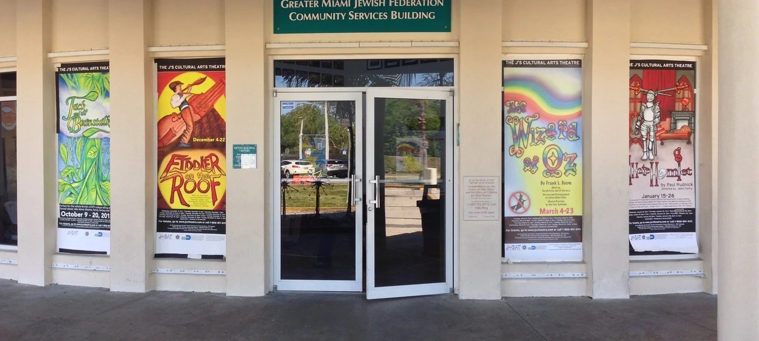
Large Format Banners displayed in the outside windows of The J's Cultural Arts Theatre. You can see another version/fromat of these designs under Posters or Illustrations.
Branding and Identity projects
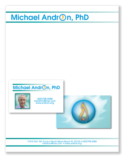
Michael is a long term client. His he has several business and wanted one identity to use for all of them. He is an energy healer and spiritual teacher, but his main business is doing bris milah for the Jewish community. The flame has been an ongoing part of his identity for many years, so that was the starting point. He wanted calming, spiritual colors and a sense of universality.
Illustrations for his book, The Essential Guide to Energy Healing can be seen in the Illustration section of this website.
His website can be seen at andron.org.
The design identity for Catherine Vogel, an attorney in private practice. Catherine is now the State Attorney of Monroe County, FL. Work for her campaign can be seen in the Design section of this website.
Food Truck groupie is a planned podcast about food trucks. The producer of the podcast wanted an identity that was simple and clean and could be printed on good quality paper at moderate expense.
Larramy Wood is a hair designer who specializes in curly hair. His priority was this specific green color to correlate with the products he was specializing in at the time.
This identity represents wheel-chair bound athletes, so is based on racing wheelchairs. The red, white and blue colors are meant to represent the American flag. The main use of this identity was on white business cards and black t-shirts.
The logo for this celebration of Appalachian Culture was based on corn- husk dolls that are a folk art of the area.
South Florida Shops Israel was an event that brought Israeli vendors to American venues, bazaar style. The symbolism is a shopping bag and the flags of the two countries. The Tshirts had to be printed in 3 colors because of the tendency of the blue to turn purple when lightened.
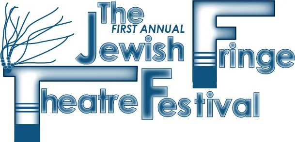
This was a festival of play readings, musical, dance and theatre performances at the Michael Ann Russell JCC in North Miami Beach, FL. The identity id based on a Jewish ritual garment and its special fringe.
The identity system for the the theatre is based on its initials and had to incorporate the star symbol of the parent organization. The colors that were allowed came form the graphic standards of the national organization.
The logo was designed with the different areas that had to be promoted over the top of the main logo in defining colors.
This logo was designed based on theatre lights. It was necessary that it incorporate the logo of the parent organization, Hillel Community Day School.
Work that celebrates type.
Fun in Cyberspace! Examples of social media projects, including videos, both user-generated and produced by Rosanne Gibel
In promoting the theatre productions at The J'c Cultural Arts Theatre, there are several challenges. Due to royalty agreements, it is often not possible to show full scenes from the show. Additionally, because this is a community theatre, parts are often double-cast and costumes are completed late in the process.
In the case of Inherit the Wind, younger audience members were not familiar with the Scopes Trial or the play itself. The videos created "hooks" that related the play content to current events or gave interesting insights into the acting and directing.
The videos were uploaded to youtube and used in email blasts, on Facebook and onTwitter. They generated many comments, a higher open rate for video and boosted attendance for this non-musical play.
JCAT's production of Handle With Care had a built-in hook; the play had been performed (with the exception of the grandmother) by the same actors in the Youth division when they were in high school. Now, it was being produced as a Community Theatre production for only one weekend.
The videos focused on the actors themselves and were produced by David Khabinsky, who is now a professional videographer.
There is a teaser which was used in email blasts, with a link to the longer video. The longer video was used on Facebook and in other promotional materials.
For over 25 years and over 100 productions at JCAT and The Hillel Community Theatre, Michael and Lillian Andron have been teachers, surrogate parents - and grandparents- to hundreds of theatre kids. They learned about theatre, Judaism, and life. All share the role as ATA’s: Andron Thespian Alumni.
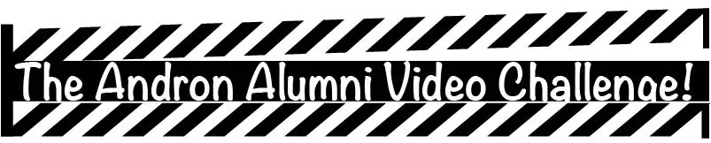
The video challenge was produced as a tribute to Michael Andron on his 65th birthday. Alums were asked to make a 1 minute video in which they stated their name, the number of shows they have done with the Androns, their favorite Andron lesson and then perform a line or lyric from their favorite show.
The ultimate goal is to find as many alumni as possible and form an alumni association. The videos are a lot of fun! If you watch very many, you will see that there are groups of alumni that name and challenge each other and that quite a few are working in the arts and entertainment industry.
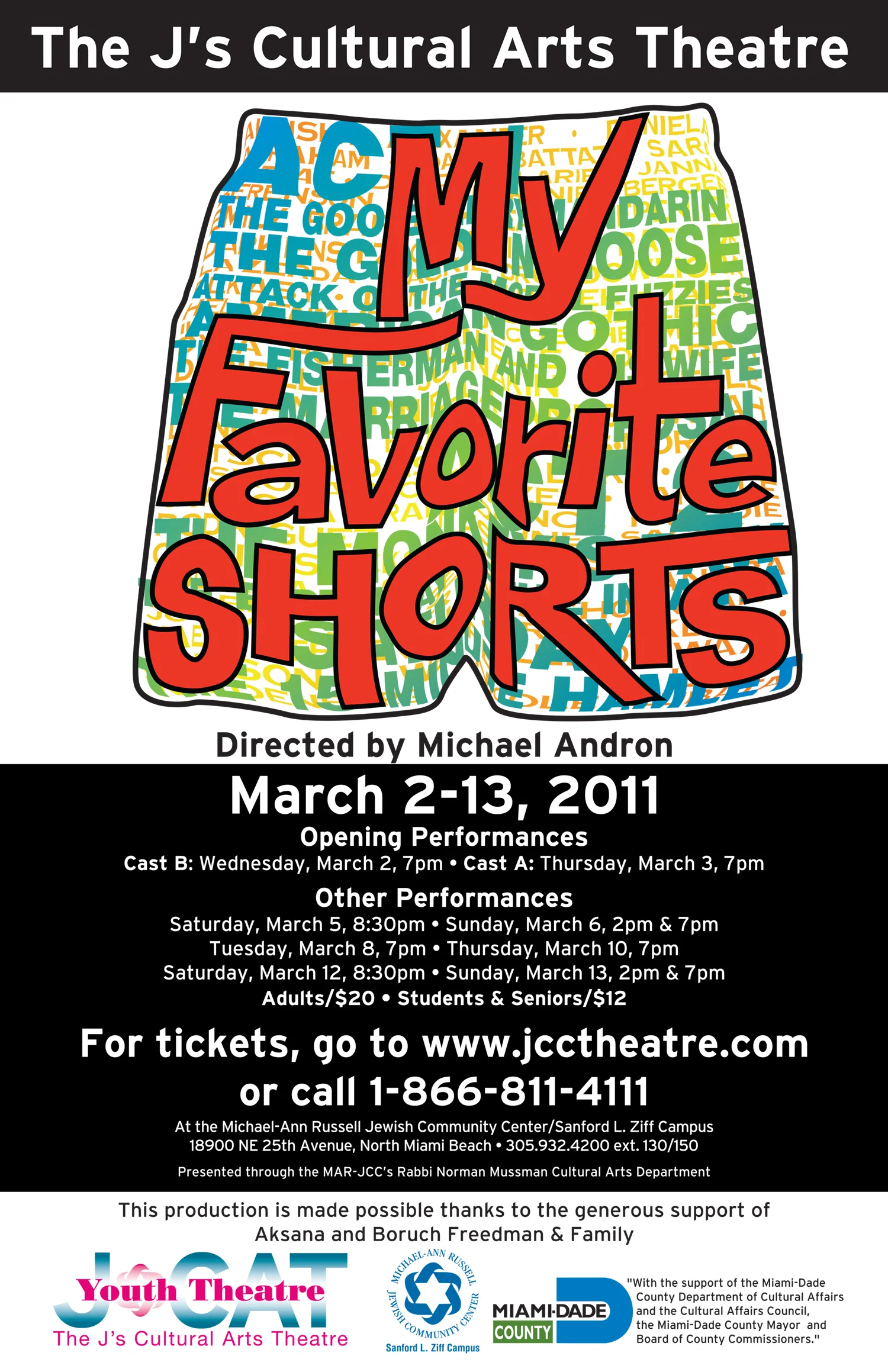
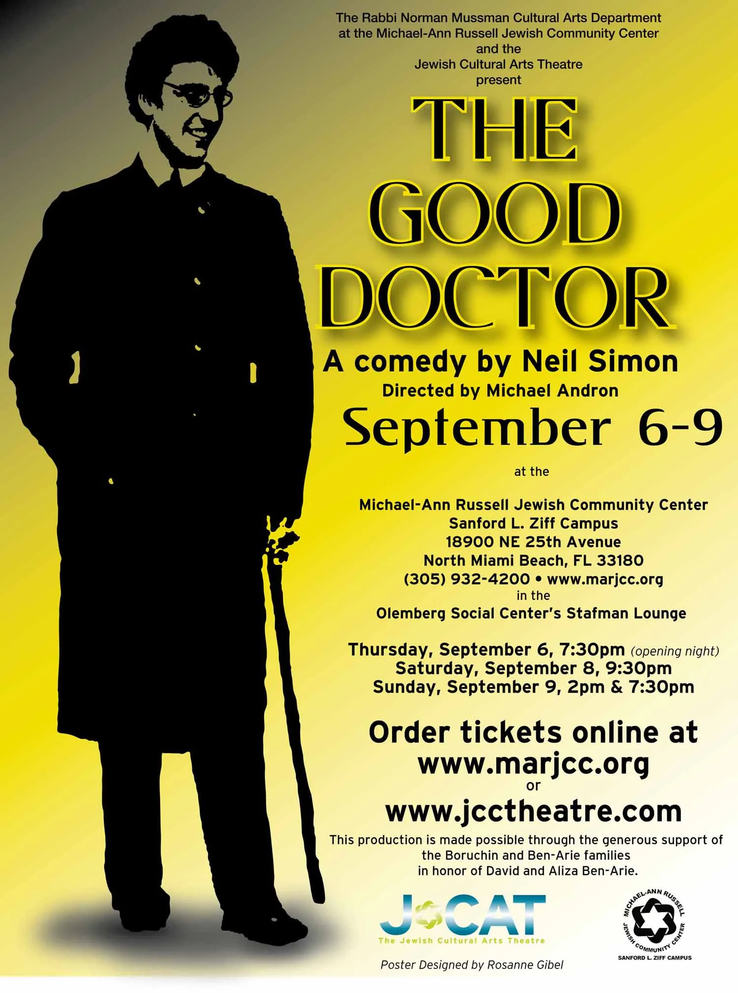
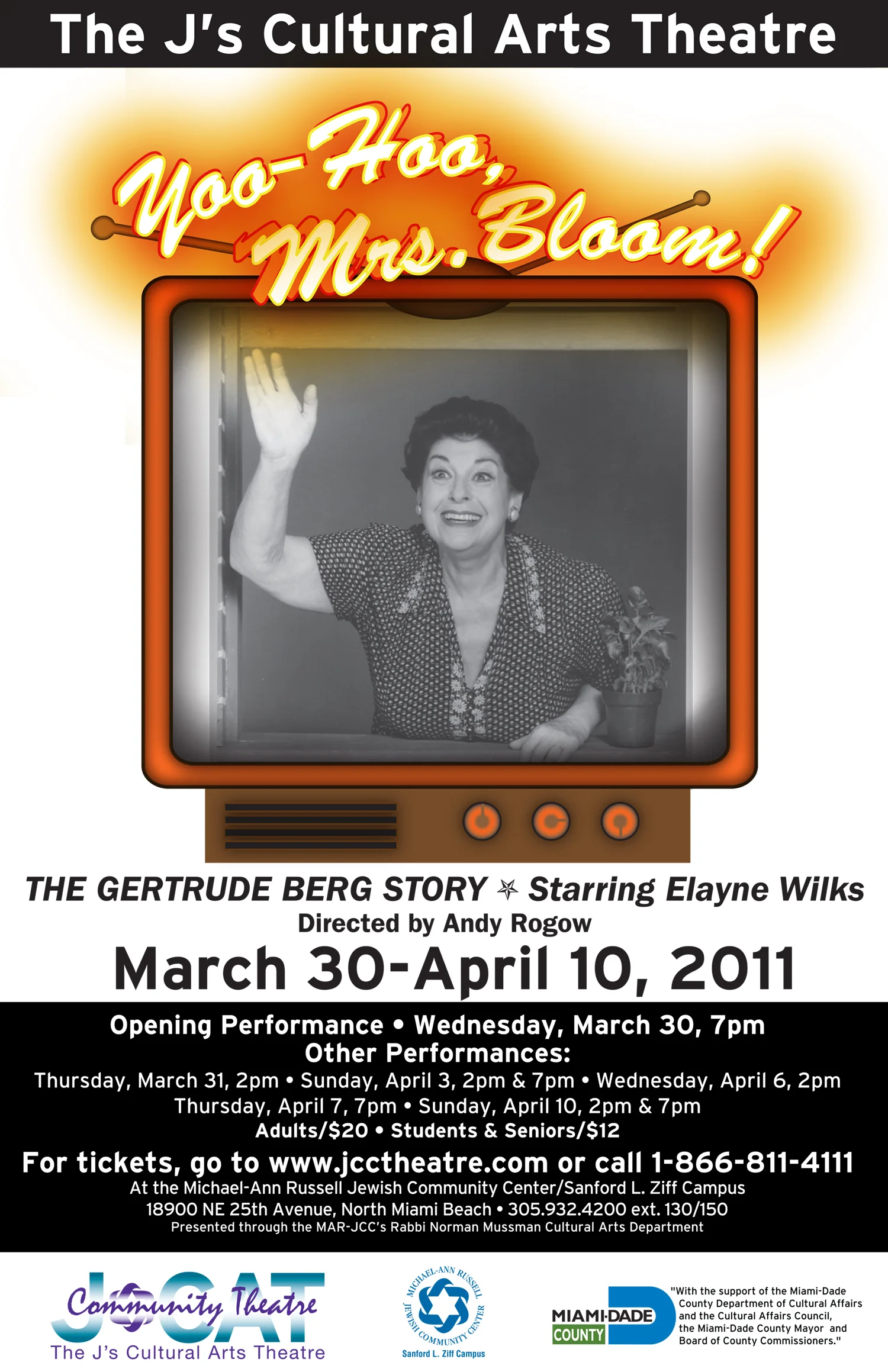
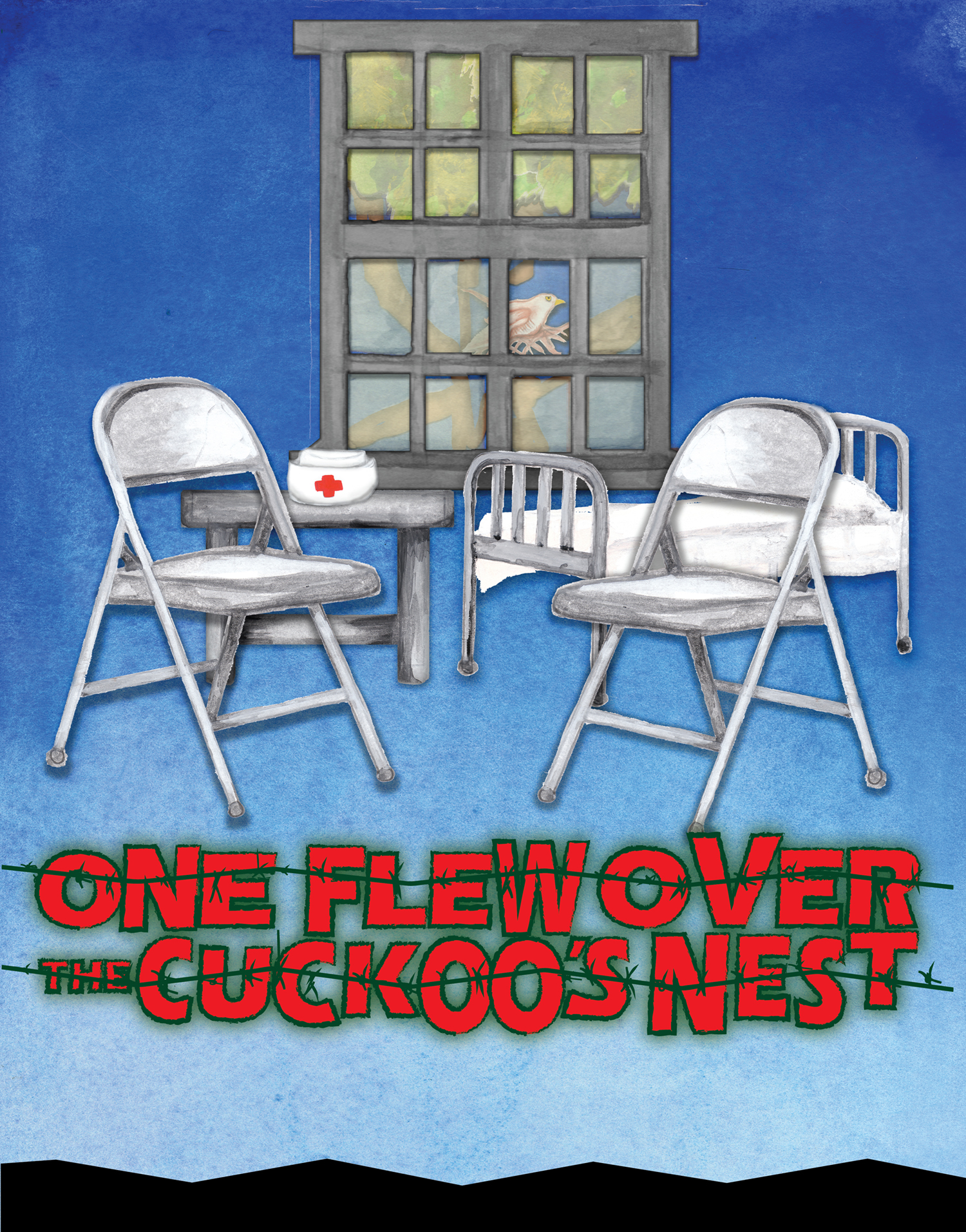
A collection of poster designs in a variety of media.
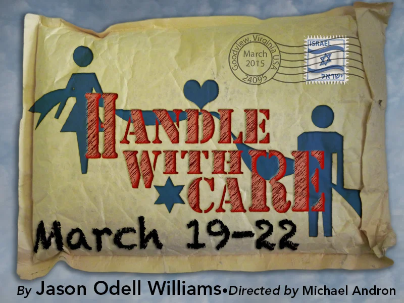
This play is a romantic comedy that revolves around a lost package, and the people who are trying to locate it in Goodview, Virginia. Two of the people are locals who do not speak Hebrew and the third is a young Israeli woman who does not speak much English. The ideas was to communicate the story with symbols.
Poster for the play My Name Is Asher Lev. In an unusual move for this theatre company, the poster featured the three actors. They are well known in the community and it was a major draw.
Commonly, musicals will have a graphic that is standard and/or required by royalties. That is not the case for Annie Get Your Gun. The challenge was to create something that would convey the sense of the play, but would not incorporate the usual imagery. This is intended to give the feel of wood type posters, but also incorporates hand painted type for the title.
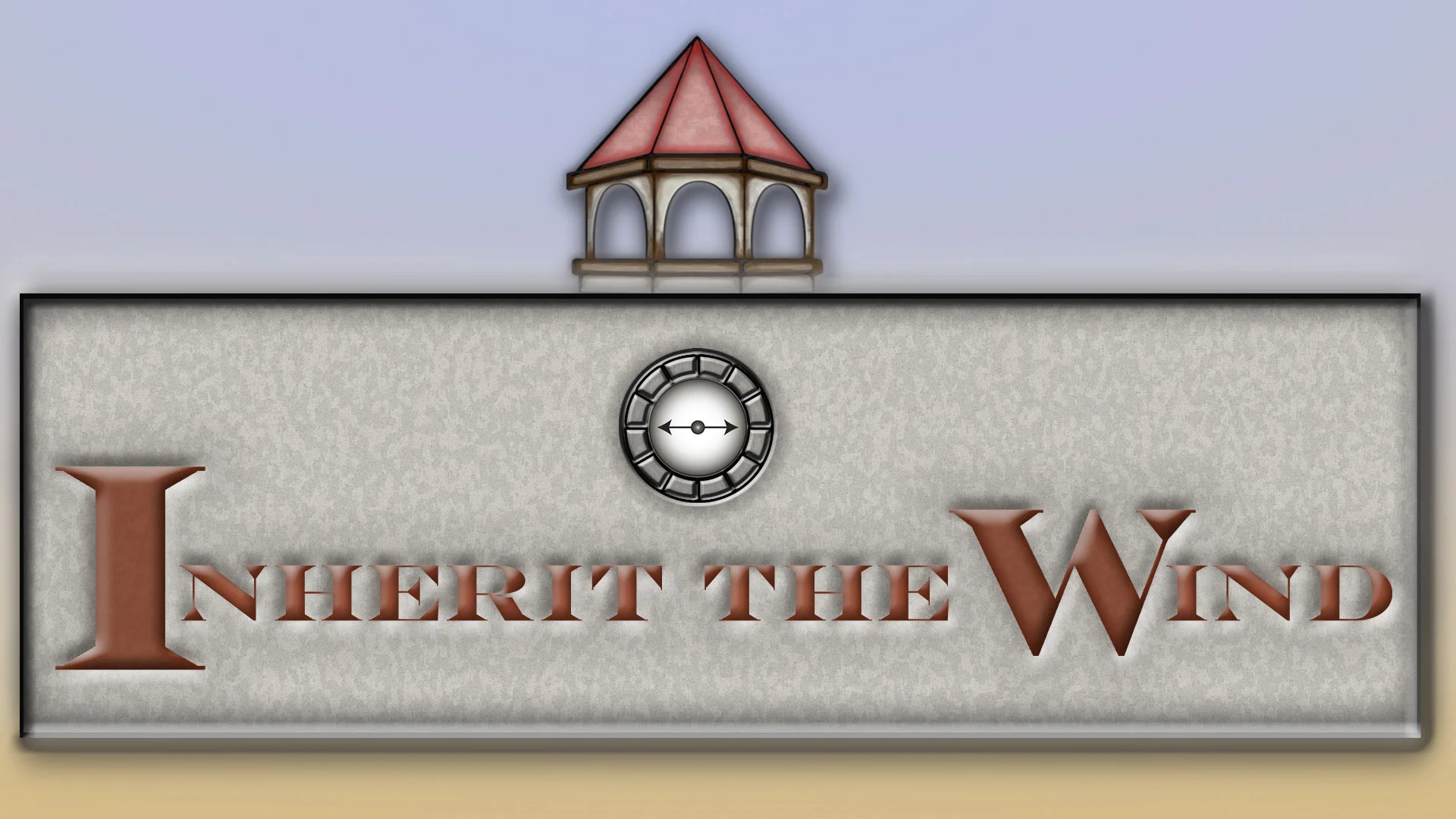
This poster is based on old-style wood type posters to give the small town feel of the play. The turret and title are based on the actual court house where the Scopes Money Trial (on which the play was based) took place.
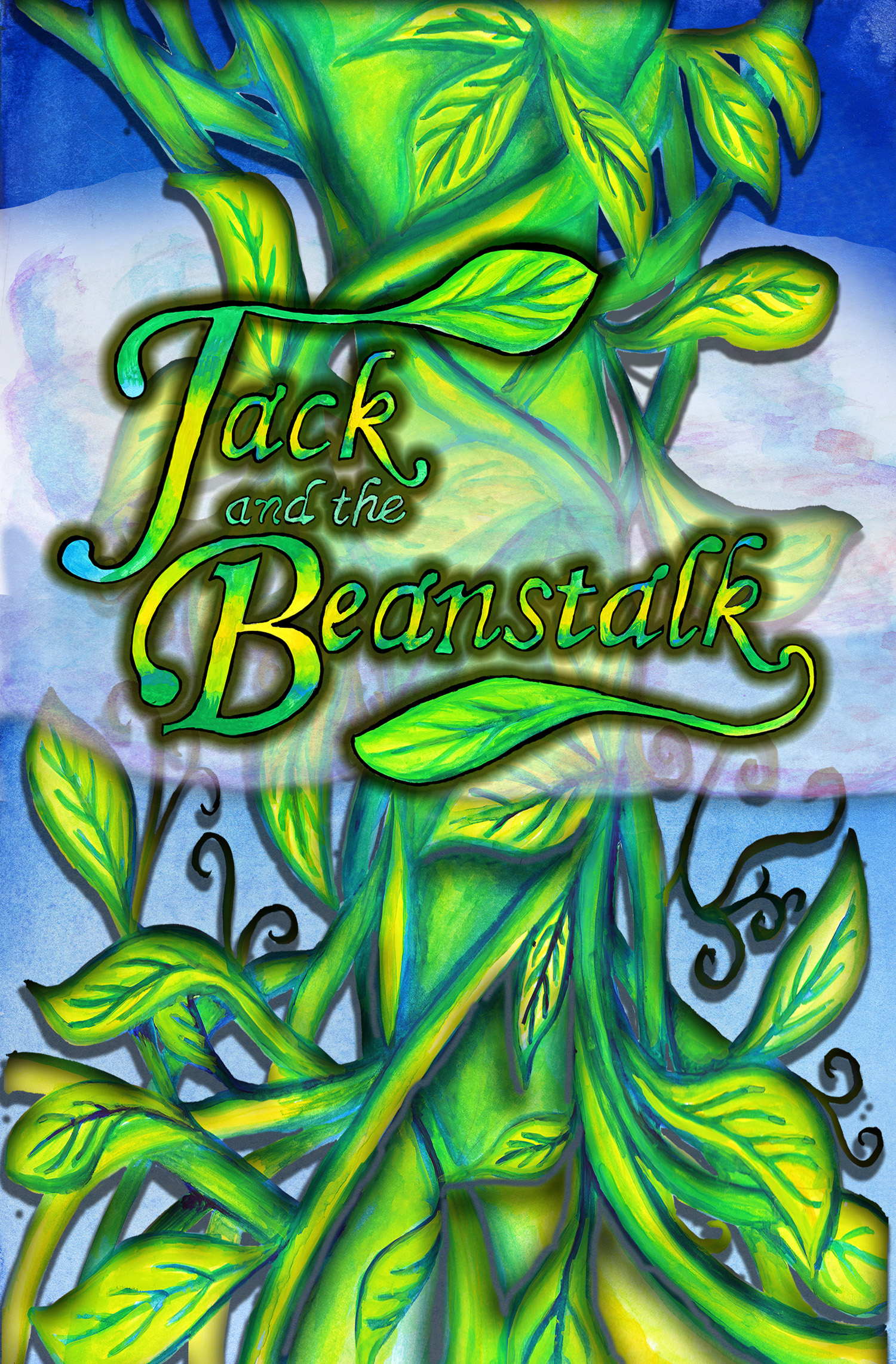
Fairy tale style script was hand painted and paired with gold and spindles, symbols of the story for this poster.
This production presents a variety of Cinderella stories from different cultures. Since they do not all employ the same symbols, fairy tail script is incorporated with a feeling of magic and transformation that is common to all the tales. Hand painted type and other elements were enhanced digitally.
Gouache illustration is combined with vector type resembling a bridge to convey the narrative of the Neil Simon play Lost in Yonkers.
his poster received a Silver Addy from the AdFed of Fort Lauderdale.
Examples of Illustrations created for theatre posters
Gouache illustration with digital enhancements. The image can be adjusted for a variety of landscape or poster layouts.
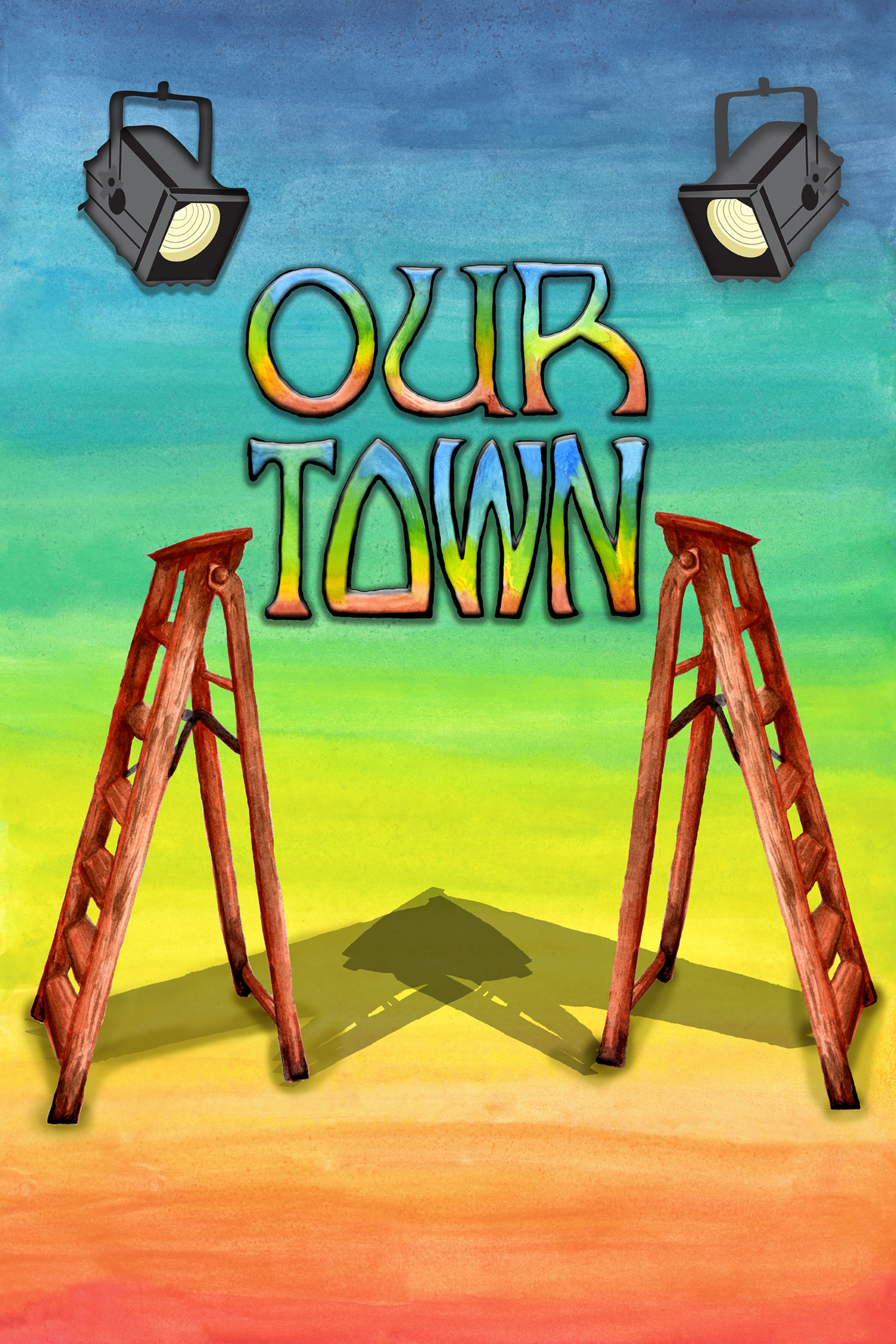
A gouache illustration for the play Our Town by Thornton Wilder.
Gouache illustration for a production of the comedy I Hate Hamlet by Paul Rudnick. The play involves an actor who is reluctantly preparing to play the role. The idea was to sue things that were important to the actual play as well as the iconic items that would represent the Shakespeare play.
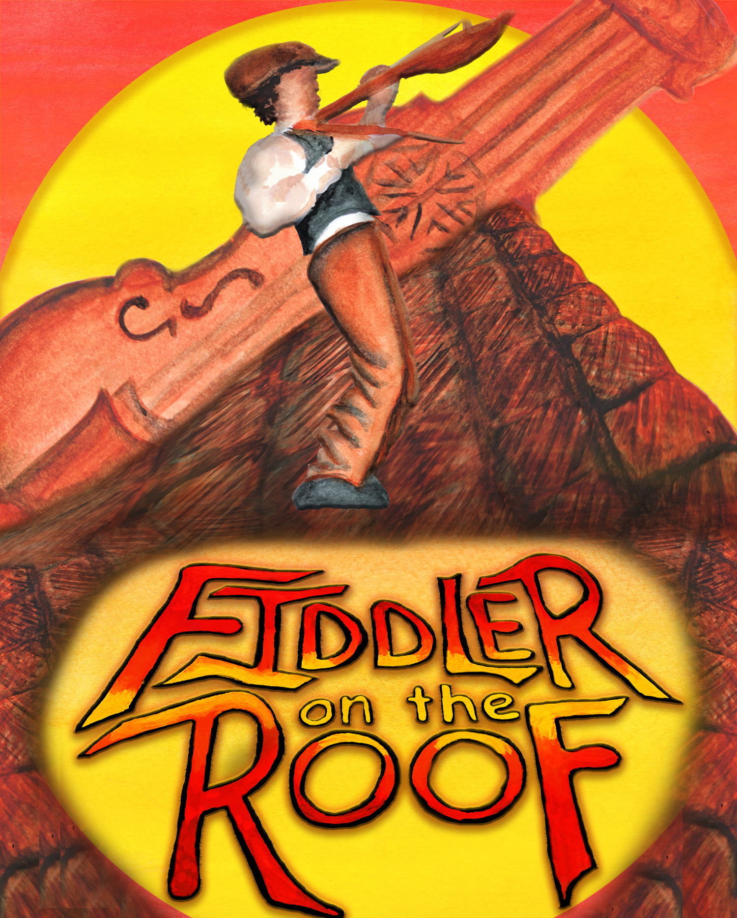
Poster illustration for Fiddler On The Roof (music by Jerry Bock, lyrics by Sheldon Harnick and book by Jacob Stein).
Oddly enough for such a well known and popular musical, there is no standard graphic for this play. The challenge was to come up with something recognizable for the topic, but with a different concept. here the colors chosen are the traditional warm colors often used, but the fiddle is a traditional klezmer fiddle which would have been used in a Russian village. The fiddler himself is not dressed to represent "traditions" but the changes of the modern. While tradition holds the town in place, it is the forces of change that make life as shaky as the "Fiddler On The Roof.
This poster illustration for the Wizard Of Oz was created with the idea of using the symbols of the play in an abstract way. I must admit that the "No witches" symbol was the idea of the director of the play, Michael Andron.
This is the painted version of the illustration for the Wizard of OZ.. It was revised for consistency with the rest of the season as well as a more sumptuous look when printed with more advanced digital processes than were available when the vector version was created.
Since this play by Celeste Raspanti was based on the writing of children during the Holocaust, it was important to balance the dark with hope and to use images to represent the concentration camps as well as easily recognized jewish symbols.